Not long ago,
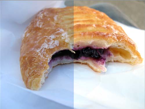
Susan was asking me why the supposedly white areas in her photographs were dingy. Actually, I thought her photos were beautiful and didn't look dingy or off-white, but it can't be denied that making adjustments in the brightness, contrast, exposure, and colors of an image can make or break it. And being able to control these adjustments in a deliberate, precise manner can only be achieved by understanding histograms. Though the term seems a little intimidating (it shares a root with "history" (yuck) and "histology"), it's really, really not.
A
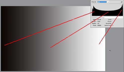
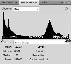
Histogram is a graph that represents all the pixels in an image, mapped out into an axis that goes from dark to light (or sometimes, light to dark, though that's not how Photoshop does it). Many cameras can show you a histogram as you're making a shot (at least my Canon Powershot G7 does) to tell you if it's looking very bright or very dark or just right. In the example above, you can see that there's a huge peak in the shadows -- that's where most of the pixels are -- then another one in between midtones and highlights, then another small one at the far end of the highlights. Pure black is represented in Photoshop as "Level 0" and Pure white is "Level 255".