The only prerequisite for this tutorial is Understanding Histograms. However, Understanding Levels will also help.
The image above has been through Photoshop. This is (approximately) the original image:
Curves can tell pixels of any brightness value to turn into another brightness value that you want. Almost all Photoshop image adjustment tools -- Brightness, Contrast, Exposure, Levels, Color Balance -- are really just the Curves tool in disguise. Anything they can do, Curves can do, and usually better (though of course those other tools were programmed to be simpler).
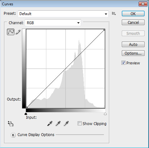
Before anything, let's take a look at the toolbox itself. Go to Image > Adjustments > Curves or press Ctrl-M (Command-M on the Mac). Why "M"? Because it kind of looks like a haphazardly drawn curve! (seriously.)
And we'll take a look at the important functions one by one.
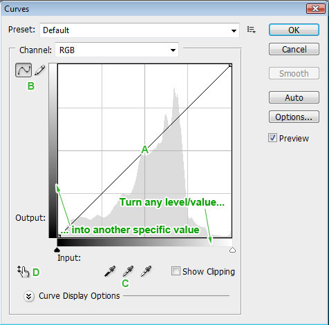
A: The curve. Here is where you will make pretty much all your adjustments in Curves. In later versions of Photoshop there is a histogram of the image behind it for your reference. In summary, you use it by finding a level on the histogram (left to right, black being on the left-most side and white on the right) and dragging it up or down (drag up to increase the level/make it lighter, drag down to decrease the level/make it darker). More on this later.
B: curve/pencil. If the curve is selected, you make the adjustments in area A by dragging points. If the pencil is selected, you make the adjustments by drawing the curve yourself in area A, which is not a really wise way to go about it if you ask me.
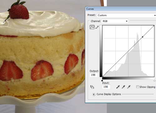
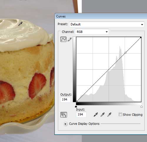
C: droppers. Just like in Levels, click on the black/50% gray/white dropper then any point in your image and it instantly becomes the black/50% gray/white point. Useful for quick image editing and white balance correction.
D: hand with arrow. This allows you to click on the image directly to make curves adjustments. I'll tell you more about it in a bit.

Simply clicking on the image when the Curves dialog is open flashes a point on the curve that represents the value of the pixel that you clicked on. No changes are made when you do this - it just helps to orient you. (Give it a try now!)
Ctrl-clicking on the image not only indicates the point on the curve that represents the value of the pixel, but it also anchors it.
This means that if you make a change to the curve in any other part of it, the anchor will always remain the same, until you drag it yourself. When you drag any point on the curve directly, it always becomes anchored.
Notice that even though the point on the curve is anchored, the rest of the curve always moves smoothly around it. The computer draws the curve so there is a smooth transition of values. (That's why it's "curve" and not "zigzag lines.")
To use the hand with arrow, click it, then click and drag a point in the image you want to brighten (drag up) or darken (drag down). No need to return to area A.
Like so. Note that my cursor is still dragging on the image, but the curve follows my mouse movements anyway.
How Curves Work

To illustrate how curves work, I made a simple image with a smooth gradient from black to white. Note that the histogram almost equally represents all the levels.
By clicking on the curve (without dragging), I anchor the points on the curve, so any change I make to one will not affect the others.
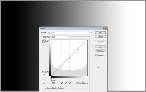
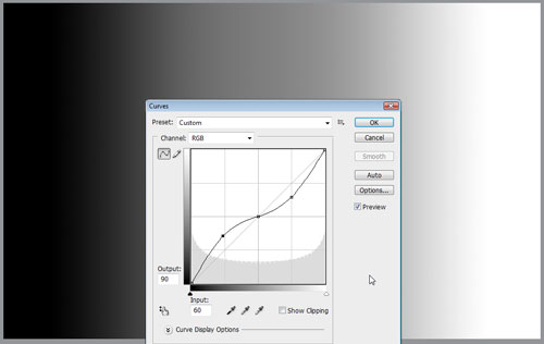
Lightening a Level
Drag a point on the curve up.

See how easy that was? Now let's try lightening a low level.
Here's how it looks in an actual photo.
Darkening a Level
Drag a point on the curve down.

And now, on a low level:
And in a photo:

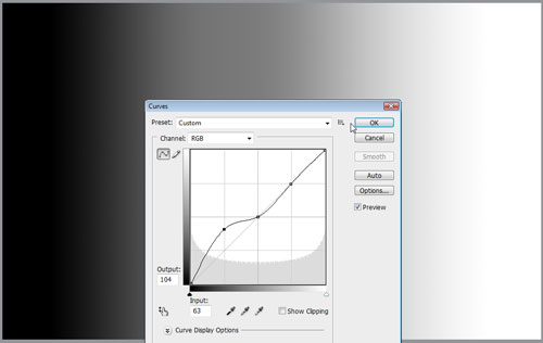
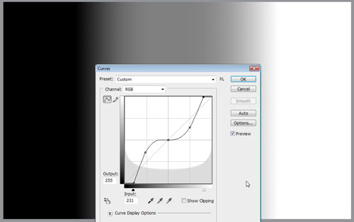
Increasing contrast
If you make high levels (highlights) brighter and low levels (shadows) darker, it increases the contrast.

As a rule, any part of the curve that becomes steeper increases contrast in that region. So as you can see, the midtones (middle levels) are higher contrast -- split more decisively between white and black. Here is the technique used on a photo:

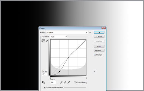
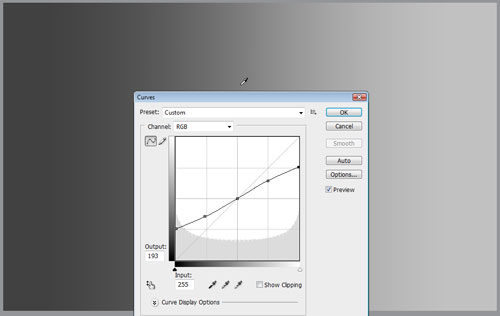
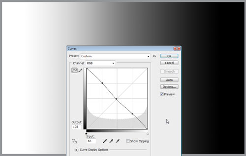
Decreasing contrast
If you make high levels darker and low levels brighter, it decreases the overall contrast.
As a rule, any part of the curve that becomes flatter decreases contrast in that region. So here, the midtones are now lower contrast. Here's that technique in a photo:

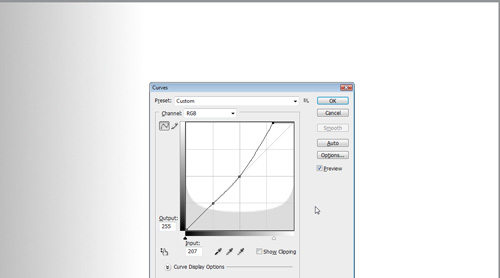
Adjusting whites and blacks
The leftmost and rightmost points of the curve represent pure black and pure white, respectively. Dragging them up or down changes black or white into gray.
Meanwhile, moving them left or right increases contrast and makes grays white or black. Note that everything to the right of the white point becomes pure white (it burns out or disappears), and everything to the left of the black point becomes pure black (it disappears into the shadow).
Curves are so flexible that you can tell highlights to turn into shadows and vice-versa.
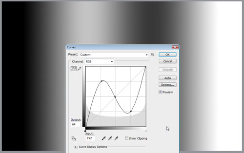
You can even tell white to turn to black and vice versa!
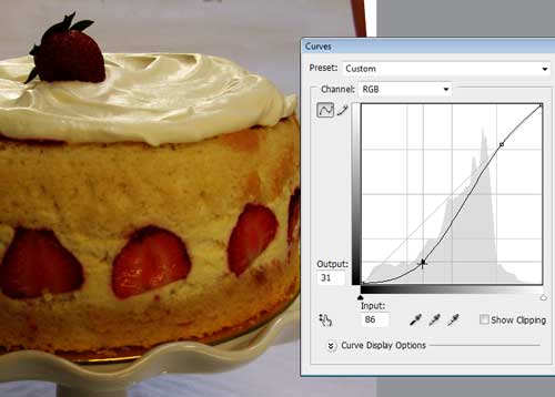
Why Curves is better than Levels
In this image I've zoomed in on only the lighter gray to white area of the image. Notice the smooth transition of gray to white when I lighten the highlights in curves. The grays may be lighter, but they are still gray (they didn't burn out or turn white).

On the other hand, moving the white slider of Levels to the left turns everything to the right of it in the histogram pure white. It burns out the image and removes subtle grays, turning them all white.
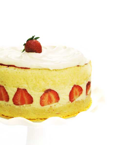
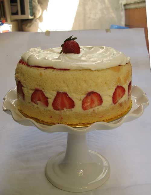
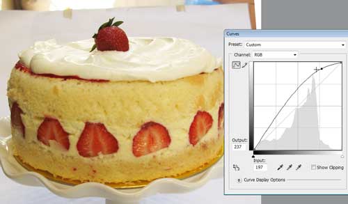
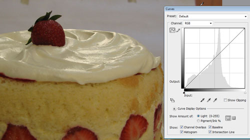
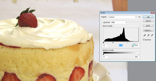
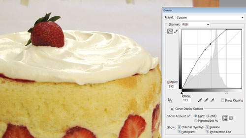
To illustrate this point in an actual image, take a look at my cake before editing:
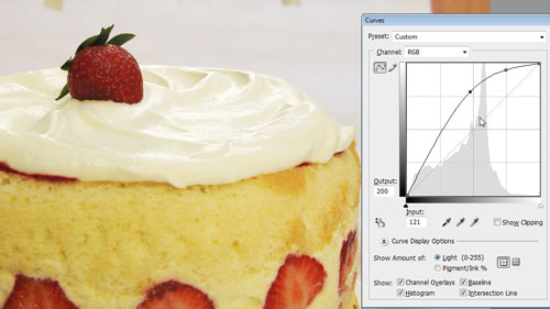
After applying a curve that lightens the image, you can see that the swirls are all still clearly defined. The grays are still present, though they are lighter.
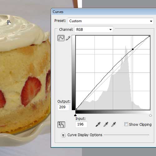
Making a similar adjustment in Levels doesn't allow for the same amount of fine-tuning. Notice how the highlights of the swirls look harsh, and a lot of detail is lost:
This burn-out effect can also be observed in Curves if you move the white point to the left:
So, that's the basics of Curves. For homework, open those problematic images, press Ctrl-M and play with the curves. Drag points all over the place and see what happens. Next time we'll have a little more fun with Curves and harness their power to make images depict exactly the mood we want.